Hello Jenny,
I'm really having a lot of fun with these now.
I drew these two together while I was eating alone today.
I'm really liking how I can just whip out a pen and paper and just let my creative fluids flow.
Anyways here are two more thumbnails that I put into studies.
I didn't have the colors that I wanted but I put the color names on the paper.
For the circles, I was thinking that two different colors merging to make a new color would look nice.
Similarly on the parallelogram ones, 3 colors merging would look pretty cool in my opinion.
Let me know what you think!
-Ted
And got this in response.
Glad it’s fun.For the circle one, how would you color the one that’s basically two with a thin strand of connection? Would that already be cyan? Or fading from green to blue with cyan in the middle? I guess the parallelogram one, the color thing would be easier, practically speaking. Still has the sense of merging very strong. Not the sense of depth, though. Would it be possible to combine the two ideas to get sense of depth AND parallelograms? I’m not advocating this, necessarily — just wondering out loud.
See you next Monday,
Jenny
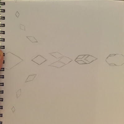
For my next version I was going to take the merging and add a sense of depth to it.
After some time this is what I got.

It would still have the cyan, magenta, yellow combining together.
I'm not exactly sure how well I executed the depth part.
The top and bottom elements sometimes appear like they are moving towards the viewer on the Z-axis. However sometimes it also looks like the element is getting bigger as it approaches the merge.
Hmmm... gonna send this off to the instructor and see what she thinks.
No comments:
Post a Comment