Tuesday, May 17, 2016

Week 7 - Observation: Balance and imbalance

This week we were to find two pieces of art that show balance and unbalance.


Instead of going my normal cheat route of going to pinterest and typing in the words, I decided to just go with a theme.

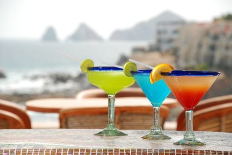
Cocktails... since I don't really drink beer anymore.


This glass of whiskey shifted over to the left side clearly draws attention to it.

I really believe the purpose of this crop was to show the name of the store on the bottom right.

If the glass was in the center, the store name would've been a little harder to read.


This is such a balanced design. Two symmetrical glasses of some pineapple drink.

This looks really good actually, I think I'm gonna go make some now.


That's about it. Nothing too impressive here! Just gotta print these out and bring them into class.

Week 7 - Class: Space

Yet again another blog post.

Just got back from Cabo and I've really just not been happy with how busy I've suddenly gotten.


Let's get right in.

First of all design shares.

This time the topic is: emphasis.


After discussing about the designs for a little bit we moved on to the lecture for the night.

Btw, these design exercises are becoming kind of dumb in my opinion. I really don't gain much value from these.


Lecture time

This time we are talking about scale and how certain things give depth a design.


Then we moved onto more interesting topics like perspective drawing.


Afterwards we got into smaller groups and got critiqued on our "tool drawings".

My skateboard thumbnails turned out to be pretty good for all the intents and purposes.


I have to share one of my classmate's drawings. His shit is so fucking good.


After my group got our stuff critiqued it was time to do an in-class lab.


We were to use gradients to display depth.


This in-class lab honestly sucked. Super boring.


Here are some of my classmates stuff though.


This one girl to my left is working on doing a project about Normandy.


This is her color scheme.


And another classmate's tool project.


Anyways class is becoming kind of a drag. It's feeling more like school than fun. Probably because I'm so busy these days.


Hopefully I can dedicate more time to these projects!!!

Tuesday, May 10, 2016

Week 6 - Moodboard: Place/Time

I'm really trying to get all my shit done really early in the week because I'm going off to Cabo for the weekend!


The task is to pull 2 or 3 images that evoke the mood or climate of the time/place.


Here are the 3 pictures of my place I picked, Cabo.


Then we were to take a series of 6 to 8 one-inch square chips and mount them on a piece of paper.


First of all, I had to take a bunch of these paint color strips from Lowe's.


Then I picked the 6 that I thought best gave the essence and feel of Cabo.


We'll see what we end up doing with these in class!

Week 6 - Thumbnails: Tool

So this week we are doing some thumbnails for a "Tool".

This tool could literally be anything that is used to do something to another object.

Could be a pizza cutter, a ruler, a knife, etc.


I picked a skateboard.

I used to be a skater back in high school except that I wasn't really that good. Well... I was except that I hung out with all the other skaters so I wasn't as good relative to them. :P


Plus I still dress like a high school skater lol.


The assignment was to take a drawing and progressively make it more simple.


Here are my first set.


The problem is... I don't really think I could make it any more simple.

I can't really take any of those element away without it not being a skateboard anymore.


So I just decided to keep drawing from different angles.


And there are my 10 thumbnails that I was required to do.

Week 6 - Observation: Emphasis

Pinterest is always the best place to locate awesome designs.

I found an awesome one from the get-go.


This is from an article, "10 ways to easily spot someone from Washington".

Apparently we have anti-water capabilities cause we never use an umbrella.

Monday, May 9, 2016

Week 6 - Class: Color

From the get-go we did our little presentation of design examples. This time it was to bring in something that has the design concept of variety.


Afterwards, we all hung up our "Two Letter" finals.

I thought mine turned out really well but I must say some of them were really fucking good.


Up next is our lecture on Color.


It started off with stuff we all knew.

Color is the light that bounces off an object.


If you combine RGB, they add up to make white.


However cyan, magenta, and yellow subtract from each other leaving black.


I found these terms fascinating.

You can increase the tones, the tint, or the shade.


Here's a closer look at some images.

You can see that if you look up really close the colors are just a bunch of dots.

This is really what happens when a printer prints something.


In-class lab

Hue - Lightness/Darkness
Value - The actual color
Saturation - How much of that color is present.


Today in class we cut out strips of colors from magazines.

The grayscale thing that we did was to match the color with the right Value, the hue and saturation are removed.


Then we took a photo of it with the "mono" setting. Let's see how I did!


Not bad eh?


Next we had a quick lab to illustrate these terms by using contrast.


And then I got my first assignment back. I got a 90% lol.

It's not like this class is really graded anyways.


Saturday, May 7, 2016

Week 5 - Reading: These readings suck

The assigned reading to so damn boring and we don't even discuss them in class so I'm no longer going to be reading them.

They're boring ass textbook materials I had to read back in grade school.

About 3 pages into the chapter, I just said "Fuck this shit".


So no more summaries of readings.


I'm sure those summaries weren't that great to read anyways haha.