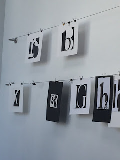

Afterwards, we all hung up our "Two Letter" finals.
I thought mine turned out really well but I must say some of them were really fucking good.


Up next is our lecture on Color.

It started off with stuff we all knew.
Color is the light that bounces off an object.

If you combine RGB, they add up to make white.

However cyan, magenta, and yellow subtract from each other leaving black.

I found these terms fascinating.
You can increase the tones, the tint, or the shade.

Here's a closer look at some images.
You can see that if you look up really close the colors are just a bunch of dots.
This is really what happens when a printer prints something.

In-class lab
Hue - Lightness/Darkness
Value - The actual color
Saturation - How much of that color is present.
Today in class we cut out strips of colors from magazines.
The grayscale thing that we did was to match the color with the right Value, the hue and saturation are removed.

Then we took a photo of it with the "mono" setting. Let's see how I did!

Not bad eh?
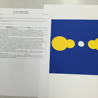
Next we had a quick lab to illustrate these terms by using contrast.

And then I got my first assignment back. I got a 90% lol.
It's not like this class is really graded anyways.

No comments:
Post a Comment