At 80% completion of my graphic design, I decided to drop out of the class.
Rather than being a joy, the class became something I dreaded going to.
I often found myself doing the least minimum possible rather than trying to crank out the best thing I possibly could.
Nothing is worse than forcing yourself to love something that you really don't.
One my life philosophies is to try all the flavors that life has to offer.
That way you'll know what flavors you like and what you don't like.
I have no regrets! :D
Monday, May 30, 2016
Monday, May 23, 2016
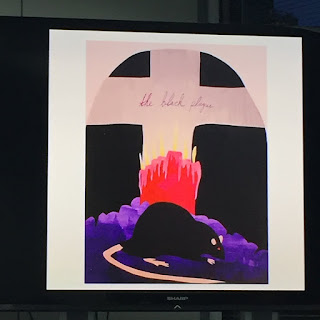
Week 8 - Class: Typography
So it appears that my class BFF is a no-go for the 2nd week in a row.
Guess she's dropped out of class. :(
But it's okay the show goes on!
As usual the design share.
This time the design principle is: symmetrical and asymmetrical balance.
Next it was time to present our tool projects.
A lot of classmates did a really good job. Kind of made mine look like shit but whatever.
Kind of starting to realize that I really do come from a math/engineering background as opposed to a design background.
But it does make me wonder. What are all these creative people doing in a beginner design class? Or am I just that crappy?
I'm thinking I might just be one of those Math/Science nerds that is brave enough to enter the art world.
Anyways here are the classmates designs.
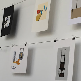
And my personal best one award (for what it's worth) goes to...
This one girl in my class is always making really good shit like this.
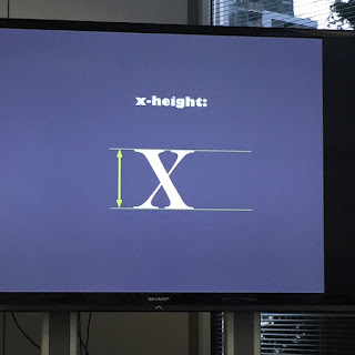
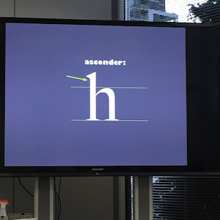
Time for the lecture!!!
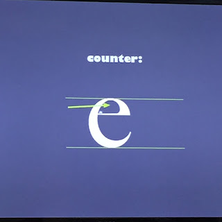
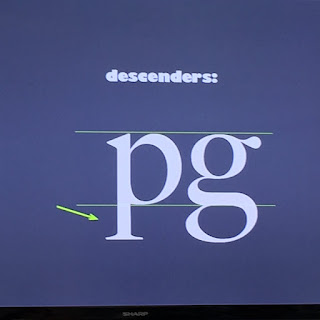
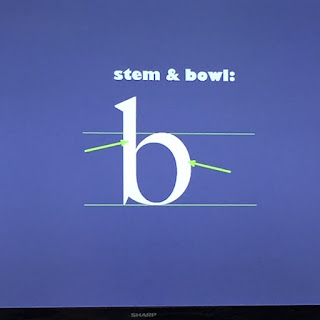
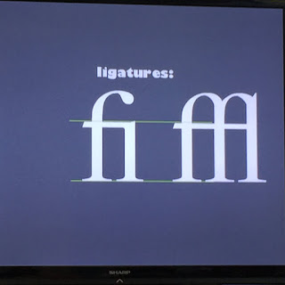
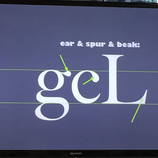
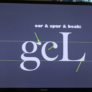
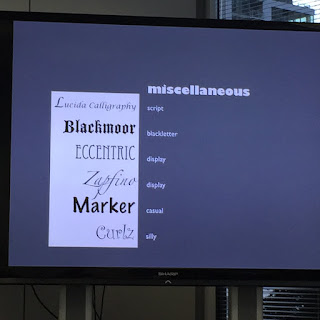
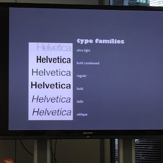
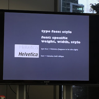
Today we are going to talk about typography.
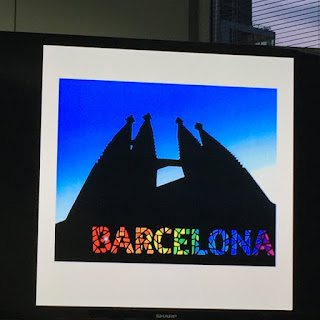
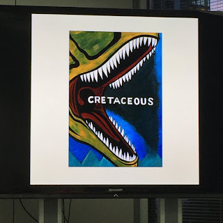
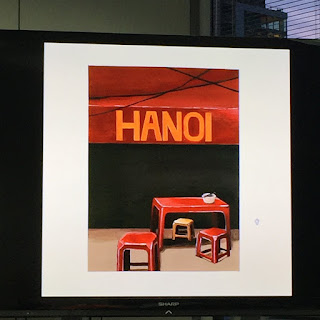
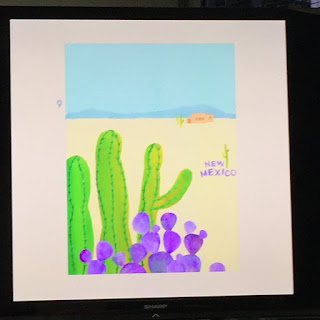
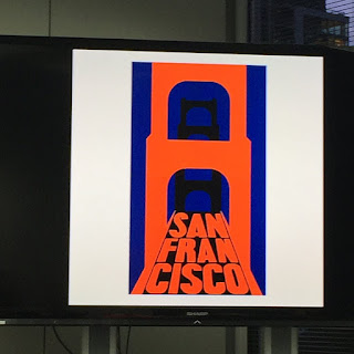
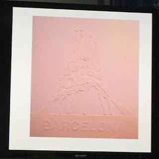
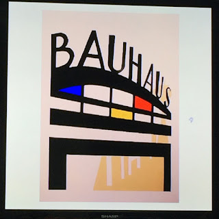
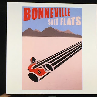
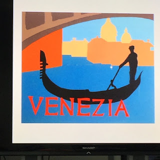
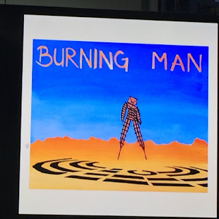
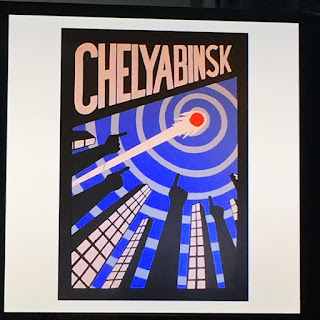
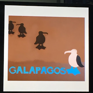
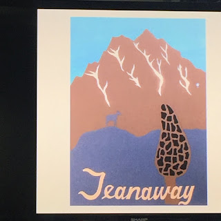
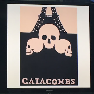
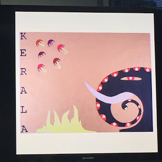
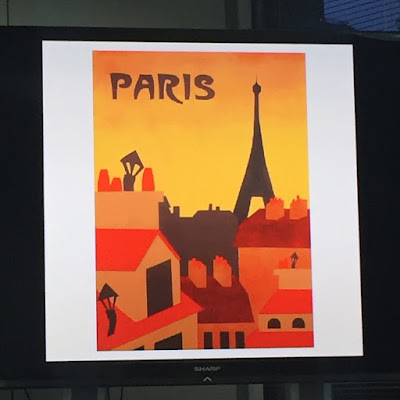
Here are just a bunch of slides that I took pictures of.
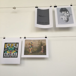
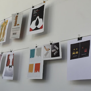
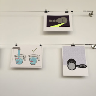
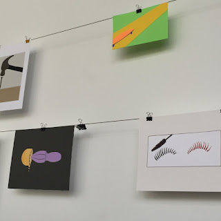
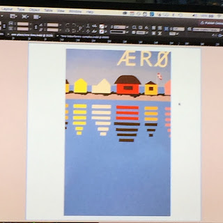
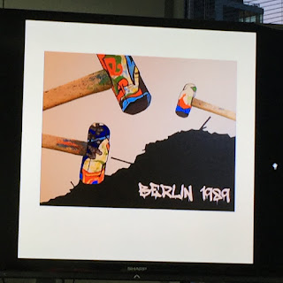
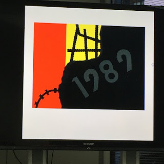
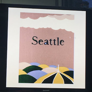
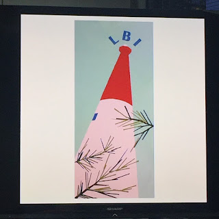
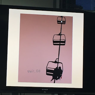
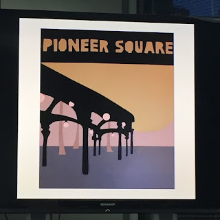
Alrighty it's time for examples of the final project!!!
Some of these are really damn good like no lie and some of them are meh...
I hope to make a project somewhere in the mid range of these designs.


That's it. Until next time!
Guess she's dropped out of class. :(
But it's okay the show goes on!
As usual the design share.
This time the design principle is: symmetrical and asymmetrical balance.


Next it was time to present our tool projects.
A lot of classmates did a really good job. Kind of made mine look like shit but whatever.
Kind of starting to realize that I really do come from a math/engineering background as opposed to a design background.
But it does make me wonder. What are all these creative people doing in a beginner design class? Or am I just that crappy?
I'm thinking I might just be one of those Math/Science nerds that is brave enough to enter the art world.
Anyways here are the classmates designs.


And my personal best one award (for what it's worth) goes to...

This one girl in my class is always making really good shit like this.
Time for the lecture!!!
Today we are going to talk about typography.
Here are just a bunch of slides that I took pictures of.


Alrighty it's time for examples of the final project!!!
Some of these are really damn good like no lie and some of them are meh...
I hope to make a project somewhere in the mid range of these designs.


That's it. Until next time!
Thursday, May 19, 2016
Week 7 - Studies: Time/Place
So our assignment was to start thinking about 5 different way to display depth with our time/place.
For all that have been following along, my place is "Cabo" and my item is a "margarita".
I tried starting off with some perspective drawing.
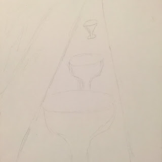
I liked the perspective but I felt like the angle wasn't quite right so I immediately did a longer version.
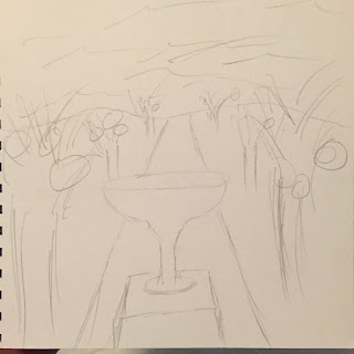
This was looking better but then I realized water doesn't go all the way up. Now it just looks like I drew the sky with squiggles.
I tried drawing this as if the margarita was on a table and the water was far away.
Didn't really turn out that well.
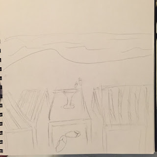
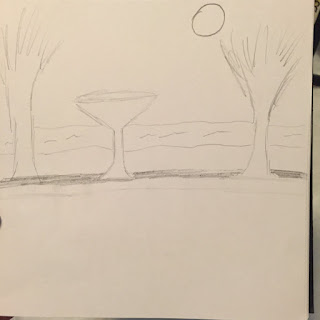
Then I drew the margarita on a table between two chairs. This is more like what I wanted to draw.
Kind of reminds me of a Corona commercial.
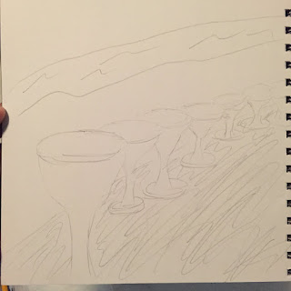
Lastly this is just an array of margaritas. The idea is that they would all be different colors.
Next Monday I'll be getting feedback on these guys so we'll see what happens.
For all that have been following along, my place is "Cabo" and my item is a "margarita".
I tried starting off with some perspective drawing.

I liked the perspective but I felt like the angle wasn't quite right so I immediately did a longer version.

This was looking better but then I realized water doesn't go all the way up. Now it just looks like I drew the sky with squiggles.

I tried drawing this as if the margarita was on a table and the water was far away.
Didn't really turn out that well.

Then I drew the margarita on a table between two chairs. This is more like what I wanted to draw.
Kind of reminds me of a Corona commercial.

Lastly this is just an array of margaritas. The idea is that they would all be different colors.
Next Monday I'll be getting feedback on these guys so we'll see what happens.
Wednesday, May 18, 2016
Week 7 - Final: Tool project
I didn't really get much feedback on my skateboard drawings except that they were good essentially.
Guess that's not a bad thing to know I'm on the right track!
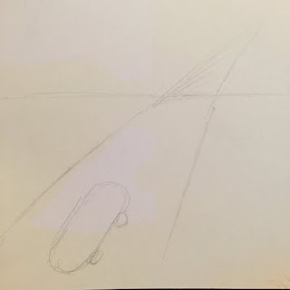
I started with drawings like these because I wanted to add a road and imply that the skateboard was going somewhere.
Then I got tired of making big drawings haha.
I continued by maybe doing a ramp to indicate that the skateboard was meant to do tricks more than a means of transportation.
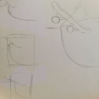
But then I really lost the sense of depth so I reverted back to my original concept.
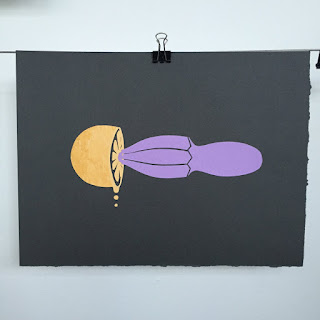
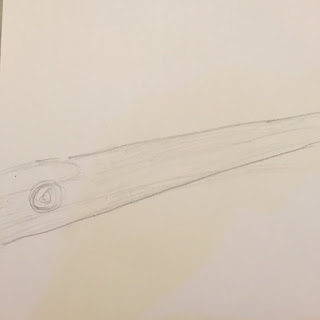
Eventually this is what I came up with and decided to go with.
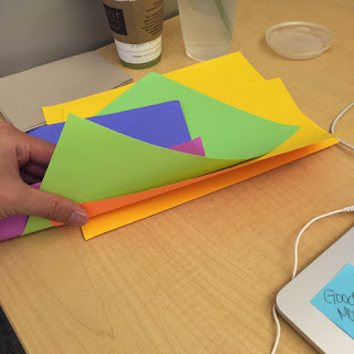
So instead of selecting which colors I wanted to use beforehand, I just grabbed a stash of colored papers that I had at home because I was in a hurry.
Turns out I only had 6 colors to choose from.
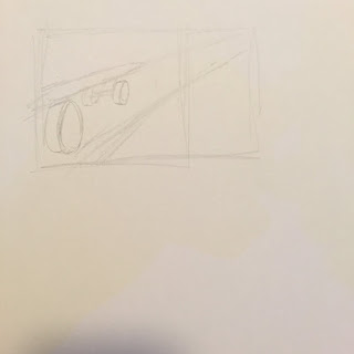
I started with the most simplest part of the design: the road.
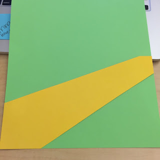
Then I decided to make the wood part of the board and just make the wheels proportional.
I needed to have a sense of depth because without the bottom line it didn't really look like it was gonna move along the Z-axis.
The board looked too 2-dimensional. So I really had the add the black part.
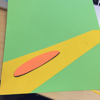
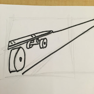
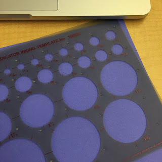
Up next were the wheels.
I'm glad I found another use for these circle template things.
After making the wheels I added them on to the road.
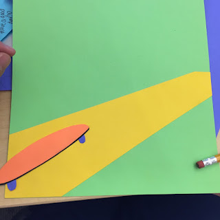
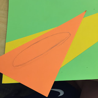
Now it was time to crop part of the board and then cut off the top.
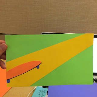
And voila. There is my final for this assignment.
Guess that's not a bad thing to know I'm on the right track!
I started with drawings like these because I wanted to add a road and imply that the skateboard was going somewhere.


Then I got tired of making big drawings haha.
I continued by maybe doing a ramp to indicate that the skateboard was meant to do tricks more than a means of transportation.

But then I really lost the sense of depth so I reverted back to my original concept.
Eventually this is what I came up with and decided to go with.


So instead of selecting which colors I wanted to use beforehand, I just grabbed a stash of colored papers that I had at home because I was in a hurry.
Turns out I only had 6 colors to choose from.

I started with the most simplest part of the design: the road.

Then I decided to make the wood part of the board and just make the wheels proportional.

I needed to have a sense of depth because without the bottom line it didn't really look like it was gonna move along the Z-axis.
The board looked too 2-dimensional. So I really had the add the black part.

Up next were the wheels.
I'm glad I found another use for these circle template things.

After making the wheels I added them on to the road.

Now it was time to crop part of the board and then cut off the top.

And voila. There is my final for this assignment.
Subscribe to:
Posts (Atom)